Map school · How-to
Should you map rates or counts?
The most common mistake in data maps is shading states by raw totals when the question is really about intensity — or the reverse. Here is how to pick the metric that answers your question, with a real example.
The misconception
Bigger numbers look like a bigger story. A reader sees Texas shaded dark on a raw-count map and concludes migration is "happening fastest" there. But a count map answers how many, not how intensely. A large population can contribute to a large count, but the ranking still needs checking. Comparing net migration relative to each state's population needs a rate.
Worked example: net domestic migration, July 1, 2024–June 30, 2025
Toggle between the two views of the same Census estimates. Net domestic migration is arrivals from elsewhere in the U.S. minus departures to elsewhere in the U.S., excluding Puerto Rico. These estimates cover July 1, 2024–June 30, 2025. They measure neither gross arrivals nor total population growth, and alone cannot establish housing or labor demand. Rankings compare the 50 states; DC appears on the maps but is unranked.
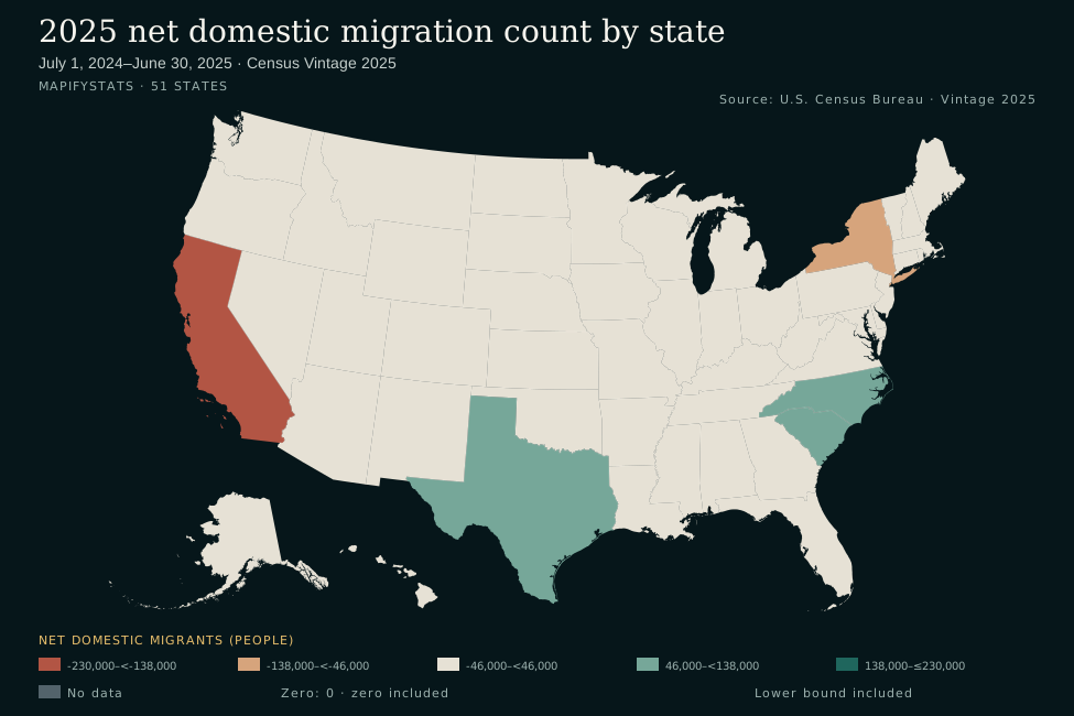
- -230,000–<-138,000
- -138,000–<-46,000
- -46,000–<46,000
- 46,000–<138,000
- 138,000–≤230,000
- No data
- Lower bound included
- Zero: 0 · zero included
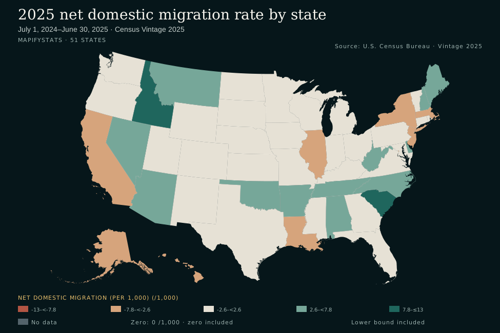
- -13–<-7.8
- -7.8–<-2.6
- -2.6–<2.6
- 2.6–<7.8
- 7.8–≤13
- No data
- Lower bound included
- Zero: 0 /1,000 · zero included
Same dataset, two defensible headlines. Neither view is wrong; they answer different questions.
The decision rule
Map rates when your question is about intensity or fair comparison: which state has the largest net domestic gain per 1,000 residents, where is an event most common per person, how does a small state compare with a large one?
Map counts when your question is about magnitude: which state has the largest net domestic gain in people, how many people are affected, what is the total?
If your headline uses words like fastest, highest rate or per capita, you need a rate. If it uses most, total or how many, you need a count.
Limitations
Rates can flatter small populations. A tiny state needs only a small absolute change to top a rate ranking — always check the underlying count before declaring a winner.
Counts favor big states — but verify, don't assume. Populous states usually dominate raw-total maps, but not always: on this measure Florida is No. 8 by count (+22,517). Check the ranking instead of assuming the big states lead.
Rates need a sensible denominator. Here the Census rate is net domestic migration divided by the average of the July 1, 2024 and July 1, 2025 resident populations, multiplied by 1,000. The denominator approximates the midpoint population. A rate is a net balance relative to population, not the share of residents who moved.
Watch the sign. Net change can be negative, and both views here handle that. The current map maker requires nonnegative point values and rejects negative ones. Other proportional-symbol designs can encode magnitude with size and sign with color or shape (see choropleth vs. proportional symbols).
Try it yourself
Open either metric in the map maker to customize its title, palette and labels:
Map the counts → Map the rates →
Data: 2025 net domestic migration counts and rates, U.S. Census Bureau Vintage 2025. See the Census component definitions.