Map school · How-to
Choropleth or dot map?
Two map types, two different readings. A choropleth fills each state with color; this proportional-symbol map places a sized circle near each state's geometric center. Pick the one whose visual logic matches your numbers.
What each map does
Choropleth: areas are shaded by value using the legend's color scale. Usually best for normalized data: rates, percentages, densities. Read direction and magnitude from the legend, especially when gains and losses use different colors.
Proportional-symbol map: a circle is placed on each location, sized by value — bigger circle means more. Useful for raw totals: populations, sales, headcounts. Circle area represents amount.
Dot-density map: many equal-sized dots each represent a fixed quantity, such as 1,000 people. Dot counts, not circle sizes, carry the totals. Dots placed within an area suggest distribution, so their placement requires care; random dots do not identify actual residents. The example below uses one proportional symbol per state or DC, not dot density.
Worked example: population growth rates and resident totals
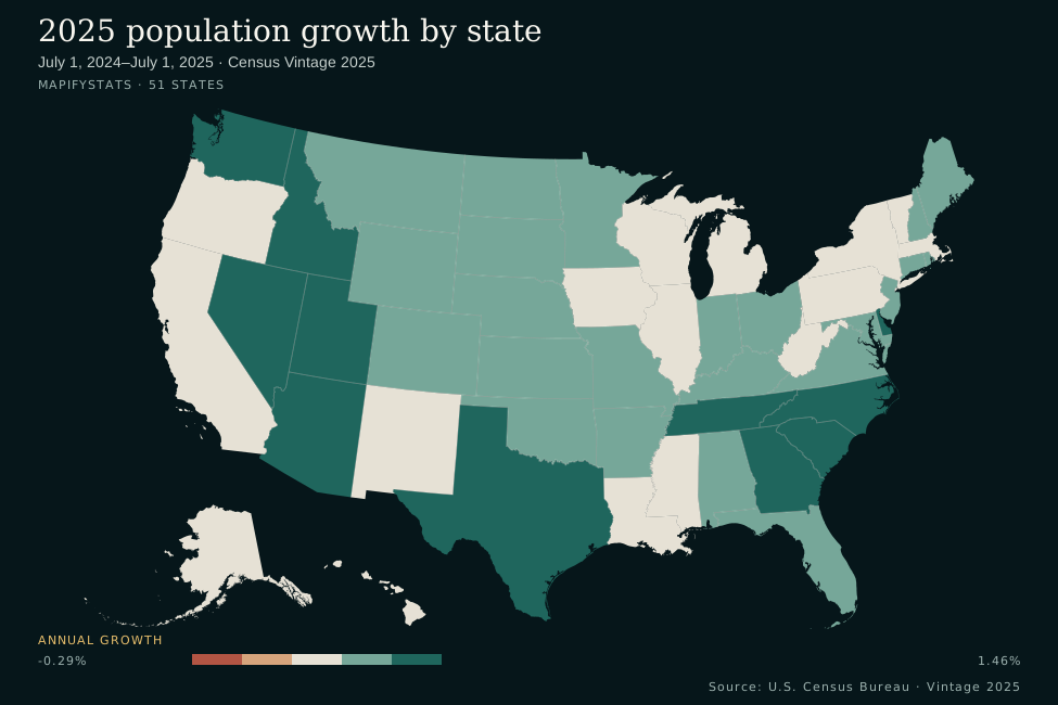
- -1.5–<-0.9
- -0.9–<-0.3
- -0.3–<0.3
- 0.3–<0.9
- 0.9–≤1.5
- No data
- Lower bound included
- Zero: 0% · zero included
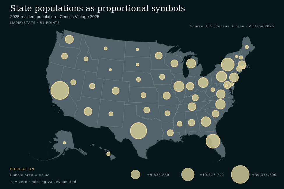
- ≈9,838,830 residents
- ≈19,677,700 residents
- ≈39,355,300 residents
One symbol per state or DC. Positions represent geometric centers, not where residents live.
Two metrics from the same Census snapshot. The choropleth shows percentage change from July 1, 2024 to July 1, 2025; the symbols show resident totals on July 1, 2025. This compares two useful pairings, not two map types rendering an identical metric. Both map types can encode rates or totals, but choose the pairing that makes your question easiest to read. Rankings compare the 50 states; the maps include DC.
The decision rule
For area comparisons, prefer a choropleth of normalized data. Rates, shares, per-capita figures and densities help readers compare areas with different populations or sizes.
For magnitudes at locations, consider proportional symbols. Counts, populations and dollar totals work well in sized circles with a size legend.
The classic error is a choropleth of raw totals: Texas looks "big" partly because it is big, and the shading confounds land area with your numbers. If the question is prevalence or intensity, normalize totals before shading areas. State boundaries and land area can distract from raw-count comparisons.
Limitations
Choropleths let empty land dominate. Large, sparsely populated states command the most ink. They also imply uniformity — one color suggests the whole state is alike, which it never is.
Symbols overlap where places cluster. In the Northeast circles overlap. The renderer draws small symbols after large ones, but overlap still makes comparison harder. Use the linked table or downloadable CSV for exact totals.
This renderer requires nonnegative point values. Circle area has no negative size; the map maker rejects negative point values rather than dropping them. Other proportional-symbol maps can size circles by absolute value and distinguish gains from losses with color or shape. Here, use a diverging choropleth for values that cross zero.
Circle areas can be hard to compare. Keep the size legend visible and provide exact totals. Very different values can leave the smallest symbols hard to see.
Try it yourself
In the map maker, choose U.S. states geography for a choropleth or latitude / longitude for proportional symbols:
Map the growth choropleth → Map the population symbols →
Data: 2025 population by state, U.S. Census Bureau Vintage 2025. The symbol coordinates are projected geometric centroids, not population centers or individual addresses. A centroid of disconnected land, such as Hawaii, may sit offshore; the point CSV is yours to reuse. Also see should you map rates or counts?. For map terminology, see Esri's proportional-symbol and dot-density documentation.